The era of clinical, cool-grey interiors is officially over. When it comes to premium timber veneers, Melbourne designers are embracing walnut and oak, which are leading the renaissance of warm minimalism that defines 2026 interiors. Walnut, with its unequalled elegance and true design heritage, never truly goes out of style, while European Oak offers a timeless alternative that complements today’s shift toward warmer, more inviting spaces.
As sustainability continues to shape the way we design, buy, and live in 2026, timber veneers Australia-wide are experiencing renewed appreciation for their material integrity and longevity. Walnut’s rich, deep tones are bringing back a warmth that has been missing from the minimalist-inspired homes of the last decade, perfectly aligning with the concept of ‘lived-in luxury’ that characterises warm minimalism design 2026. Indeed, the workability of walnut has been favoured by craftspeople for centuries, making it an ideal choice for architectural timber finishes that require precision and attention to detail.
Whether you’re renovating a heritage property in Toorak or designing a contemporary kitchen in Kew, your choice between these two distinguished timbers will significantly impact the spatial flow and visual character of your interior. This guide will help you navigate the technical distinctions, aesthetic implications, and practical considerations when selecting between these premium veneers for your warm minimalist home.
Visual & Tonal Qualities: The Designer’s Palette
Understanding the visual language of timber is essential for creating spaces with intention. The difference between walnut and oak extends beyond surface aesthetics—it fundamentally alters how you perceive and experience your interior environment.
Grain Architecture
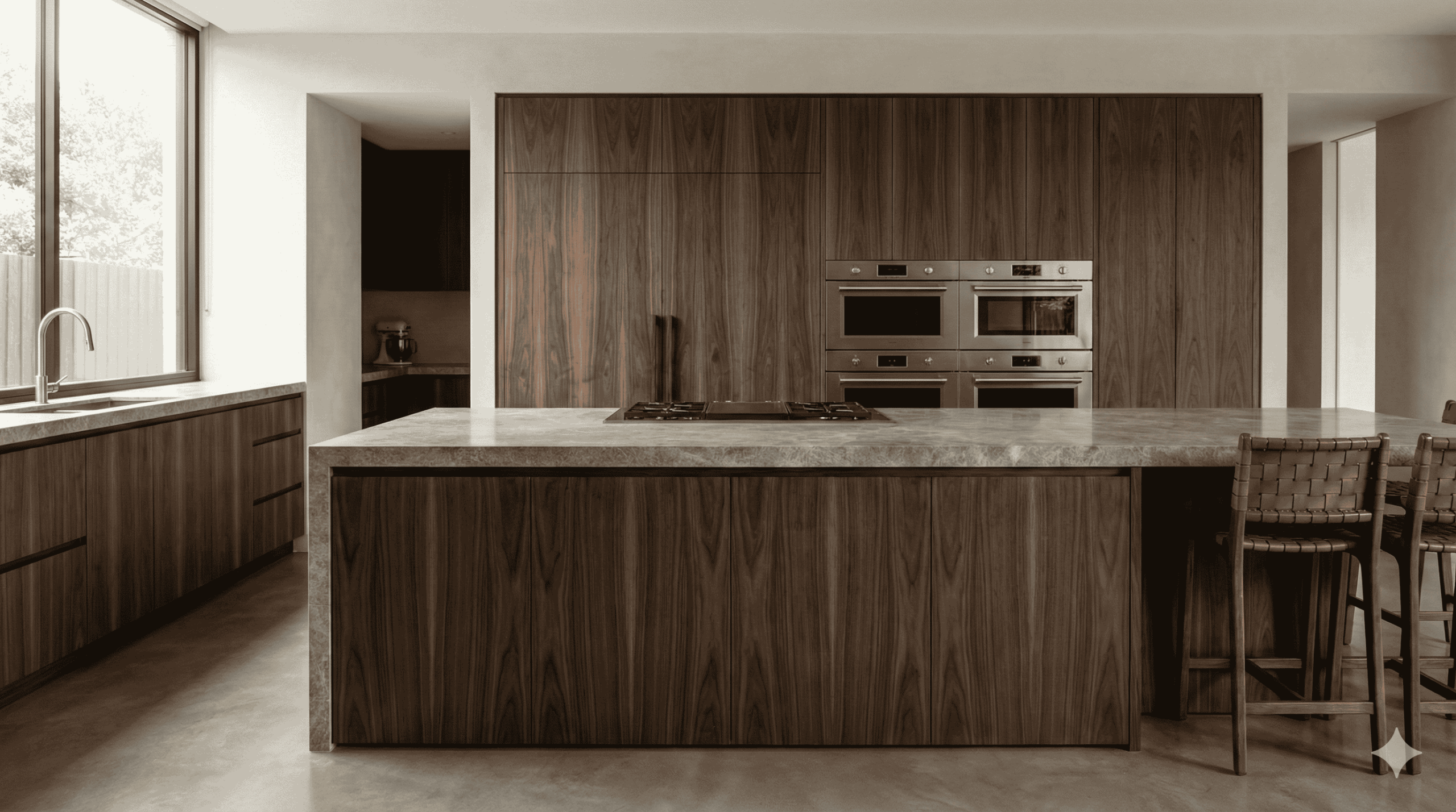
Walnut veneer presents an unmistakable personality with its cathedral patterns and dramatic figuring. The interwoven grain creates dynamic movement across panel surfaces, featuring rich chocolate-to-black streaking that demands attention. This natural complexity makes walnut particularly suitable for feature areas where visual texture adds depth to your minimalist palette.
Oak, conversely, offers a more disciplined grain structure with pronounced straight lines and distinctive ray flecks. These vertical elements provide architectural rhythm and structure, creating visual order in open spaces. Furthermore, quarter-sawn European oak displays medullary rays—those shimmering ribbons of cells that catch light differently as you move through a space.
Light Absorption & Spatial Impact
The light absorption coefficient of timber significantly impacts spatial perception. Walnut’s deep tone absorbs approximately 65% more light than European oak, making it particularly effective for creating visual anchors in expansive Toorak properties. Specifically, in open-plan configurations exceeding 60 square metres, walnut joinery provides necessary visual weight, preventing the “floating furniture” effect that undermines spatial definition.
In contrast, European oak reflects ambient light, enhancing the perception of volume in more contained spaces. This quality makes it exceptionally suitable for Brighton’s coastal residences, where maximising natural light amplifies connection to the landscape beyond.
2026 Colour Pairing
For 2026, the coordination between timber and adjacent finishes requires precise calibration. Walnut harmonises beautifully with the season’s earthy neutrals like Moka Mousse and Terracotta Blush, creating tonal continuity. Oak, alternatively, provides excellent contrast against deeper wall tones such as Storm Cloud or Midnight Navy, simultaneously complementing lighter finishes like Cloud Dancer.
The key consideration remains material integrity across transitions—ensuring your palette maintains cohesion throughout the home, regardless of which premium timber veneer anchors your design scheme.
The Technical Standard
The technical execution of veneer application determines whether your investment in premium timber delivers genuine material excellence or merely surface aesthetics. Mastering veneer craftsmanship requires both artistic vision and precision engineering.
Book-Matched vs. Slip-Matched
Book matching, the most prevalent technique in architectural applications, creates symmetrical patterns by flipping alternating veneer leaves like pages in a book [1]. This method produces mirror-image continuity that showcases the timber’s natural character, essentially amplifying dramatic grain features in walnut’s cathedral patterns. However, book matching can produce an unintended “barber pole” effect where alternating leaves reflect light differently [2].
Slip matching, alternatively, places consecutive veneer leaves side-by-side without flipping [1]. This approach eliminates the mirror effect but creates consistent, repeating grain patterns [3]. For quarter-sawn oak with its pronounced straight lines, slip matching often yields superior results by maintaining visual uniformity and minimising the risk of barber poling [2].
Panel Orientation
In heritage properties with ceiling heights exceeding 3 metres, vertical grain orientation (long band) naturally draws the eye upward, accentuating architectural volume [4]. Consequently, walnut’s dramatic figuring becomes more pronounced when oriented vertically in Toorak’s classical interiors.
Horizontal grain direction, despite being less traditional, can visually expand narrow spaces and create a contemporary aesthetic that suits Brighton’s coastal residences. With oak’s structured grain, horizontal orientation establishes a sense of width and stability.
Engineering the Edge
The waterfall edge—where grain flows continuously over mitered joins—demands exceptional precision, primarily with straight-grained veneers [5]. Quartersawn oak typically yields superior waterfall edges due to its consistent grain structure and stability [5].
Walnut’s dramatic grain requires careful selection and sequential matching to achieve seamless flow across mitered corners [6]. For premium results, the waterfall edge should maintain zero reveal on the outside face, with minimal 1/16–1/8 inch roundovers that preserve the slab aesthetic whilst softening the touch [6].
Functional Performance & Lifecycle Excellence
Beyond aesthetics, premium timber veneers must deliver exceptional functional performance throughout their lifecycle. Understanding the material science behind these surfaces allows for informed selection based on practical requirements as well as visual preferences.
Durability & UV Stability
Oak demonstrates superior hardness on the Janka scale (1290-1500) compared to walnut’s more moderate rating (1010) [7]. This makes oak veneers particularly suitable for high-traffic zones where resistance to denting is crucial. Nonetheless, walnut still offers respectable durability, typically lasting 30+ years with proper care [8].
Under Australian sunlight, oak tends to lighten slightly over time, whereas walnut naturally darkens [7]. The application of protective clear coatings containing UV-absorbing additives significantly reduces—though does not eliminate—UV-driven discolouration [9].
Hardware Synergy
Premium veneers demand equally sophisticated hardware systems. Blum Legrabox offers load-bearing capacities of 40-70kg [10], ensuring minimal drawer sag even under substantial weight. This precision-engineered system creates a “synchronised feather-light glide” [10] that complements the material integrity of architectural timber finishes.
Longevity
Quality veneer installations can last 15-20 years or longer [11] when properly maintained in climate-controlled environments. Maintaining stable humidity levels remains essential, as wood’s hygroscopic properties cause expansion and contraction with moisture fluctuations [12]. Additionally, protecting veneers from direct sunlight using appropriate window treatments preserves their original character throughout their lifecycle.
Design Applications: A Suburb-by-Suburb Guide
Premium timber veneers showcase their versatility across Melbourne’s most distinguished suburbs, each area demanding unique material applications to complement distinctive architectural contexts.
Kew (3101)
Kew‘s heritage-heavy landscape embraces modernist elegance where walnut veneer excels. In these spacious interiors, floor-to-ceiling walnut panels with vertical grain create a powerful tree-trunk illusion, wrapping interactive cores housing integrated kitchen walls [13]. This iconic 1950s-60s modernist aesthetic, reminiscent of retro stereo cabinets, brings essential warmth to minimalist spaces through its rich chocolate tones.
Toorak (3142)
Throughout Toorak‘s prestigious addresses, oak veneer serves as the connective tissue between heritage and contemporary elements. Original Tasmanian oak floorboards, once hidden beneath carpets, now become focal points in renovations [14]. Oak veneer simultaneously complements both classic architecture and minimalist interiors, bringing visual cohesion by extending from floors to joinery and island benches [14]. For bespoke library cabinetry featuring rare timber veneers, book a private material consultation with veneer specialists who understand Toorak’s architectural heritage [15].
Local Sourcing & Sustainability
Melbourne’s veneer specialists increasingly emphasise sustainability through FSC certification (FSC-C107681) [16]. This efficient production method yields remarkable coverage—one cubic metre produces over 1000m² of timber veneer, 40 times more than solid timber [16]. Cabinet Timbers, established for over 100 years, sources ethically from Australia, North America and Europe [17], offering both quarter-cut (producing straight-line patterns) and crown-cut (yielding crown-like figuring) options for distinctive applications [17].
Comparison Table
Walnut vs Oak Veneer Comparison
| Characteristic | Walnut Veneer | Oak Veneer |
| Grain Pattern | Cathedral patterns with dramatic figuring and interwoven grain | Disciplined grain structure with straight lines and distinctive ray flecks |
| Light Properties | Absorbs 65% more light than Oak; creates visual anchors | Reflects ambient light; enhances volume perception |
| Colour Harmony | Pairs with Moka Mousse and Terracotta Blush | Complements Storm Cloud, Midnight Navy, and Cloud Dancer |
| Book-Matching Performance | Shows dramatic cathedral patterns; may create “barber pole” effect | Less dramatic pattern matching |
| Slip-Matching Performance | More complex due to dramatic grain | Superior results with pronounced straight lines |
| Waterfall Edge Performance | Requires careful selection for seamless flow | Superior performance due to consistent grain structure |
| Durability (Janka Scale) | 1010 | 1290-1500 |
| UV Response | Naturally darkens over time | Tends to lighten slightly |
| Lifespan | 30+ years with proper care | Not specifically mentioned |
| Best Applications | – Vast modernist kitchens (Kew) – Feature areas – Open-plan spaces >60m² | – Heritage properties – Coastal residences – Bridging classic and contemporary design |
| Spatial Effect | Creates depth and visual weight in large spaces | Enhances airiness and volume in contained spaces |
Conclusion: The Silk Touch Selection
Choosing between walnut and oak veneers ultimately depends on your specific spatial requirements, architectural context, and aesthetic preferences. Walnut offers dramatic cathedral patterns with rich chocolate tones that create visual weight and depth in expansive spaces, particularly suitable for Kew’s modernist kitchens and open-plan configurations exceeding 60 square metres. Oak, conversely, provides disciplined grain structure with distinctive ray flecks that enhance airiness and volume perception—making it ideal for Brighton’s coastal builds and heritage properties requiring visual cohesion.
The technical execution of your chosen veneer significantly influences both aesthetic impact and longevity. Book-matching amplifies walnut’s dramatic figuring while slip-matching delivers superior results with oak’s pronounced straight lines. Additionally, the orientation of grain—vertical or horizontal—alters spatial perception, either drawing the eye upward in high-ceiling heritage homes or visually expanding narrow spaces.
Functional considerations certainly extend beyond visual appeal. Oak demonstrates superior hardness (1290-1500 on the Janka scale) compared to walnut (1010), though both deliver exceptional durability when properly maintained. Under Australian conditions, walnut naturally darkens while oak tends to lighten slightly, factors worth considering for long-term material integrity.
Material selection represents just one crucial decision in creating warm minimalist interiors. Equally important are precision engineering, hardware selection, and professional installation. Before finalising your decision, book a private material consultation with veneer specialists who understand the unique characteristics of both timbers and can advise on their application in your specific architectural context.
The renaissance of warm minimalism through premium timber veneers offers a perfect balance between material authenticity and contemporary design. Whether your preference leans toward walnut’s rich, dramatic presence or oak’s structured airiness, both timbers deliver exceptional spatial quality, technical sophistication, and lasting beauty that will define your interior spaces for decades to come. These architectural timber finishes undoubtedly transcend trends, becoming integral elements of homes that balance visual warmth with minimalist restraint.
Key Takeaways
Choosing between walnut and oak veneers for your warm minimalist home requires understanding their distinct visual, technical, and functional characteristics to achieve the perfect balance of material authenticity and contemporary design.
• Walnut creates dramatic depth: Its cathedral patterns and rich chocolate tones absorb 65% more light than oak, making it ideal for anchoring expansive open-plan spaces exceeding 60 square metres.
• Oak enhances spatial airiness: With disciplined grain structure and light-reflecting properties, oak maximises volume perception in contained spaces and coastal builds.
• Technical execution determines longevity: Book-matching amplifies walnut’s figuring whilst slip-matching delivers superior results with oak’s straight lines; both require precision engineering for 20+ year lifecycles.
• Durability varies significantly: Oak’s superior hardness (1290-1500 Janka scale) versus walnut’s moderate rating (1010) makes oak better suited for high-traffic zones requiring dent resistance.
• Grain orientation alters perception: Vertical grain draws eyes upward in high-ceiling heritage homes, whilst horizontal orientation visually expands narrow spaces in contemporary settings.
Both premium veneers offer exceptional spatial quality when properly matched to your architectural context, with walnut excelling in modernist applications and oak bridging classic and contemporary design elements seamlessly.
FAQs
Q1. How do walnut and oak veneers differ in their visual impact on a space? Walnut veneers feature dramatic cathedral patterns and rich chocolate tones, absorbing more light and creating visual anchors in large spaces. Oak veneers, with their straight grain structure, reflect more light and enhance the perception of volume, making spaces feel airier.
Q2. Which veneer is more durable for high-traffic areas? Oak veneer is generally more durable, with a higher Janka hardness rating (1290-1500) compared to walnut (1010). This makes oak more resistant to denting and wear, particularly suitable for high-traffic zones in the home.
Q3. How do these veneers age over time in Australian conditions? Under Australian sunlight, walnut veneer tends to naturally darken over time, while oak veneer slightly lightens. Both can maintain their integrity for 20+ years with proper care and protection from UV exposure.
Q4. What are the best applications for walnut and oak veneers in different Melbourne suburbs? Walnut veneers excel in creating warmth in vast modernist kitchens, particularly in areas like Kew. Oak veneers are ideal for bridging classic and contemporary design elements, making them suitable for heritage properties in suburbs like Toorak.
Q5. How does grain orientation affect the perception of space with these veneers? Vertical grain orientation draws the eye upward, accentuating height in spaces with high ceilings. Horizontal grain orientation can visually expand narrow spaces, creating a more contemporary aesthetic. The choice depends on the specific architectural context and desired spatial effect.
References
[1] – https://www.asiarchitectural.com/veneer-matching/
[2] – https://www.forteopenings.com/blog/veneer-matching-101-how-to-achieve-stunning-wood-grain-patterns
[3] – https://www.salesuncle.com/understanding-bookmatch-vs-slip-match-veneers/
[4] – https://timberveneer.asn.au/methods-of-sequence-matching/
[5] – https://www.finewoodworking.com/2020/02/06/veneered-waterfall-edging?srsltid=AfmBOorvYsBDHxbNRt9xrQ3om57ks2ZqJDpN2TLnLDbOZfubHj45k_4R
[6] – https://www.coohom.com/article/diy-waterfall-table-step-by-step-guide-for-stunning-results
[7] – https://eurekaergonomic.com/blogs/eureka-ergonomic-blog/oak-vs-walnut-wood-table-guide?srsltid=AfmBOorD4HuIn-205f-QllNYAy1Y6uCU2c7oNI3BBTWhnFYBbWNml3R3
[8] – https://duramagicfloor.com/walnut-vs-oak-pros-cons-and-how-to-choose-the-right-wood/
[9] – https://timberveneer.asn.au/minimising-colour-change/
[10] – https://www.blum.com/au/en/products/boxsystems/legrabox/overview/
[11] – https://www.veneer-hobridge.com/news/What-Is-Wood-Veneer-Types-Benefits-and-Common-Uses-Explained.html
[12] – https://www.formwood.com/caring-for-your-wood-veneer-maintenance-tips-for-longevity/
[13] – https://vibedesign.com.au/kew-house-3/
[14] – https://architectureau.com/articles/toorak-house-melanie-beyon-architecture-and-design/
[15] – https://cananhomecabinets.com.au/luxury-veneer-cabinetry-toorak/
[16] – https://matildaveneer.com.au/certification_the-proof-of-sustainability/
[17] – https://www.cabinettimbers.com.au/timber-veneers-melbourne/